纯CSS画太极图
看了CSS开发者大会各位大佬的分享,万物皆可CSS不再是随口说说的
我的有趣的CSS仓库也提供了在线预览有趣的CSS传送门),求star!!!
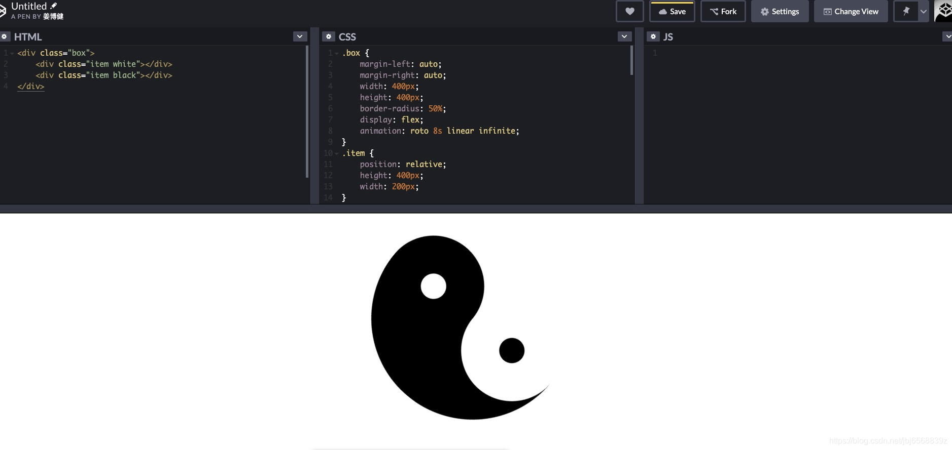
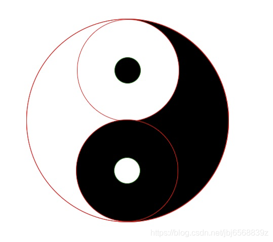
旋转的太极-在线预览
先上图
布局思路
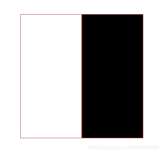
一、 画出两个长方形(宽是高的 二分之一即可)组成一个正方形,我们称为“大圆”
CSS:
.box {
    display: flex;
    margin: 0 auto;
    width: 400px;
    height: 400px;
}
.item {
    position: relative;
    height: 400px;
    width: 200px;
    border: 1px solid red //为了标出白色的图形,加了一个红的边,之后会删掉
}
.white {
    background: rgba(255, 255, 255, 1);
}
.black {
    background: rgba(0, 0, 0, 1);
}
html:
注意!!! Html代码只有这些
注意!!! Html代码只有这些
注意!!! Html代码只有这些
<div class="box">
    <div class="item white"></div>
    <div class="item black"></div>
</div>
二、利用border-radius将两个长方形画成两个半圆
.box {
    margin: 0 auto;
    width: 400px;
    height: 400px;
    border-radius: 505;
    display: flex;
}
.item {
    position: relative;
    height: 400px;
    width: 200px;
    border: 1px solid red
}
.white {
    border-top-left-radius: 200px;
    border-bottom-left-radius: 200px;
    background: rgba(255, 255, 255, 1);
}
.black {
    border-top-right-radius: 200px;
    border-bottom-right-radius: 200px;
    background: rgba(0, 0, 0, 1);

}
利用::after分别对两个长方形生成摆在大圆中轴线,大小是大圆一半的圆。我们称为“中圆”
图中的中圆的边框是我为了让大家更醒目的看到添加的,最后别忘了删除掉
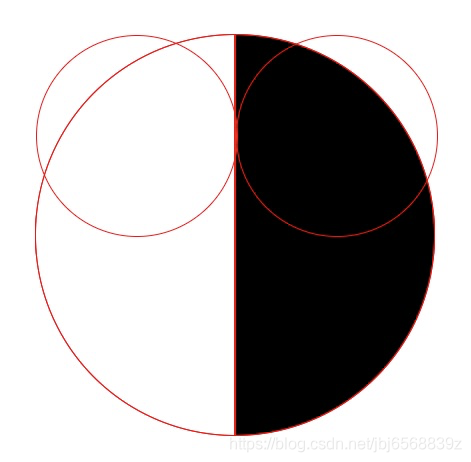
.box {
    margin: 0 auto;
    width: 400px;
    height: 400px;
    border-radius: 505;
    display: flex;
}
.item {
    position: relative;
    height: 400px;
    width: 200px;
    border: 1px solid red
}
.white {
    border-top-left-radius: 200px;
    border-bottom-left-radius: 200px;
    background: rgba(255, 255, 255, 1);
}
.black {
    border-top-right-radius: 200px;
    border-bottom-right-radius: 200px;
    background: rgba(0, 0, 0, 1);
}
.white::after,
.black::after {
    content: '';
    position: absolute;
    width: 200px;
    height: 200px;
    border-radius: 50%;
    z-index: 10;
    border: 1px solid black
}
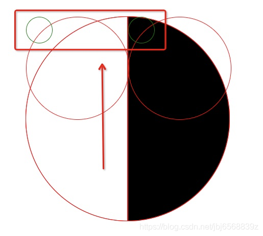
利用::before分别对两个长方形生成摆在大圆中轴线,大小是大圆八分之一的圆。我们称为“小圆”
在上一步中圆的基础上加上这段代码
图中的小圆的边框是我为了让大家更醒目的看到添加的,最后别忘了删除掉
.white::before,
.black::before {
    content: '';
    position: absolute;
    width: 50px;
    height: 50px;
    border-radius: 50%;
    z-index: 100;
    border: 1px solid green;
}
调整中圆和小圆的定位
在上一步的基础上添加
        .white::after {
            top: 0;
            left: 50%;
            background: white;
        }
        .white::before {
            left: 87.5%;
            top: 18.75%;
            background: black;
        }
        .black::after {
            bottom: 0;
            right: 50%;
            background: black;
        }
        .black::before {
            right: 87.5%;
            bottom: 18.75%;
            background: white;
        }
设置动画,让大圆旋转起来(记得删除掉border哦~)
- 给包裹两个长方形的盒子添加动画属性就会让太极图旋转起来!
附上完整代码
<!DOCTYPE html>
<html lang="en">

<head>
    <meta charset="UTF-8">
    <meta name="viewport" content="width=device-width, initial-scale=1.0">
    <meta http-equiv="X-UA-Compatible" content="ie=edge">
    <title>tai-chi</title>
    <style>
        body {
            padding: 100px;
        }

        .box {
            margin: 0 auto;
            width: 400px;
            height: 400px;
            border-radius: 505;
            display: flex;
            animation: roto 8s linear infinite;
        }
        .item {
            position: relative;
            height: 400px;
            width: 200px;
        }
        .white {
            border-top-left-radius: 200px;
            border-bottom-left-radius: 200px;
            background: rgba(255, 255, 255, 1);
        }
        .black {
            border-top-right-radius: 200px;
            border-bottom-right-radius: 200px;
            background: rgba(0, 0, 0, 1);

        }
         .white::after,
        .black::after {
            content: '';
            position: absolute;
            width: 200px;
            height: 200px;
            border-radius: 50%;
            z-index: 10;
        }

        .white::before,
        .black::before {
            content: '';
            position: absolute;
            width: 50px;
            height: 50px;
            border-radius: 50%;
            z-index: 100;
        }

        .white::after {
            top: 0;
            left: 50%;
            background: white;
        }
        .white::before {
            left: 87.5%;
            top: 18.75%;
            background: black;
        }
        .black::after {
            bottom: 0;
            right: 50%;
            background: black;
        }
        .black::before {
            right: 87.5%;
            bottom: 18.75%;
            background: white;
        }

        @keyframes roto {
            from{
                transform: rotate(0deg);
            } to{
               transform: rotate(360deg);
            }
        }
    </style>
</head>

<body>
    <div class="box">
        <div class="item white"></div>
        <div class="item black"></div>
    </div>
</body>

</html>
如果您觉得感兴趣,或者还有帮助到您,不妨给我的github点个star吧~